The main challenge identified was the lack of brand consistency spanning from their marketing site to their core product offerings. The design process was cumbersome from design to development, prompting the need for streamlining. As the brand was undergoing growth and scaling, it became evident that the existing system was not equipped to meet these evolving demands. MediaHQ did not have a design system so it was a project I undertook myself and spend months on.
Welcome to MediaHQ's Design System, a strategic framework meticulously crafted to address critical challenges and elevate the overall design ecosystem of the brand. Upon my arrival at MediaHQ, it quickly became apparent that the lack of brand consistency across products and services was impeding the establishment of a unified visual identity. From the marketing site to the core product, the disjointed brand elements created a fragmented user experience.
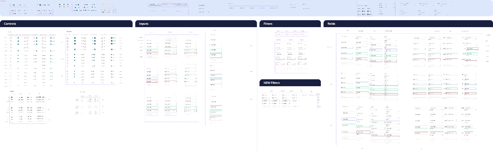
The first step in creating the design system was to build the foundations or rules of the design system. I did this by first selecting the colour palette, typography and layout based on what was best for the current state of the app. Then I took advantage of Figma’s variables later down the line when this feature was released. This step of the system is called primitive, as everything documented here would tell every other component or token how to behave and changes to any brand etc down the line would subsequently change the entire design system without having to redo the entire library.

After this foundation of the design system was created. Creating tokens using thiese primitives helped with creating and managing styles in the app as everything in the future would be implemented with accuracy and when making changing to existing app these styles could be updated so going forward it would be easier to keep track of our design system for both designers and developers.

Now that the basis of the design system was created the next step was to start creating a component library. I would build each component as atoms and separate them based on size. This ment then I could create a component with a set of multiple properties so each component could be used in many different sizes, states and so on. This meant that designers would not have to create the same components over and over again and developers could reference the specs.

1. I really learned a-lot from creating this design system as I learned about the development process and how to best work alongside them.
2. After this system was created it streamlined how we as designer worked with the developers, handoff became a lot more smooth and over the course of the year the design of the app was significantly more consistent throughout
Some design systems I love and took inspiration from were: Teamworks mobile UI Library (which I had the pleasure of seeing first hand being created during my time as an intern), Vercel, Wise, Revolut and many more!
1. I really learned a-lot from creating this design system as I learned about the development process and how to best work alongside our development team.
2. After this system was created it streamlined how we as designers worked with the developers, handoff became a lot more smooth and over the course of the year the design of the app was significantly more consistent throughout
Some design systems I love and took inspiration from were: Teamworks mobile UI Library (which I had the pleasure of seeing first hand being created during my time as an intern), Vercel, Wise, Revolut and many more!