The project aimed to improve the app's user experience by redesigning the search feature. Feedback and analytics revealed users underutilized search, impacting user lists and press release coverage. The challenge was to encourage users to use search filters while respecting their behaviours and usage.
This was a large project that was split into 2 parts: profiles and search & filters. As well as a redesign I had to accommodate database restructures and solve the technical issues that arose as well as taking users experience into consideration.
The initial objective was to revamp the profiles, driven by user experience concerns. A couple of issues needed addressing: profiles opening in a new tab, meaning users couldn't quickly scan their results, resulting in a cumbersome experience. The structure of the profiles was confusing, prompting a simplification to enhance overall usability and create a more visually appealing UI.

To start, I examined the profile analytics to understand user interactions. Given the visual nature of profiles, most information was there just to provide users with context. Because of this I was cautious about removing any elements. To gain insights, I conducted a brief questionnaire, asking users about the key aspects they considered important in their profiles. The findings indicated consistency in the information users valued, but revealed a need for refinement in the presentation of outlets due to unnecessary features and information overload.
Following this, I initiated the ideation and design phase.


After finalising a design solution that solved these issues, I presented it to my team. Following a few adjustments, we collectively approved the design. To validate its usability, I conducted a test using Maze, assigning users straightforward tasks to assess their ability to find typical information. The test gauged whether the profile design met expectations or fell short. This proved to be a valuable validation of the design, and as a team we were happy to implement this design.
I analysed analytics and user behaviour for the search function. What I discovered was that our users mainly relied on the search bar and seldom utilised filtering. The goal was to encourage users to leverage filters for more precise and accurate results.

I began researching examples of search and filtering designs in various products to understand how they effectively manage large sets of results.

I tried out lots of different solutions, but one problem we kept running into was that some of our filters had hundreds of tree options which made creating quick filtering options difficult to implement.

One potential solution to address the filtering challenge involved introducing a new search feature. However, I had reservations about whether our users would embrace this idea. To explore options, I presented various concepts to our team, and consensus on the best design proved challenging. Opting for user testing and research, we encountered difficulty creating a prototype that accurately reflected the complexities of the search function. Developing a plan, I conducted a usability test via video call, revealing that users persisted in using the search as expected, despite efforts to promote filtering. Consequently, I decided to simplify the search design to maintain user familiarity while subtly incorporating filtering without causing disruption.

A simple search page with main focus on the search bar, that's not overwhelming when you open it.

Ability to apply filters in recommended results.

Tabs that categorise by media type in the results instead of having to filter
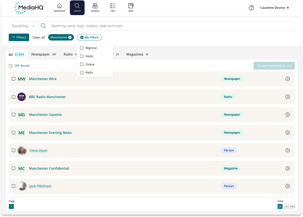
Customisable quick and easy filtering

Show/Hide filter tab for advanced filtering.